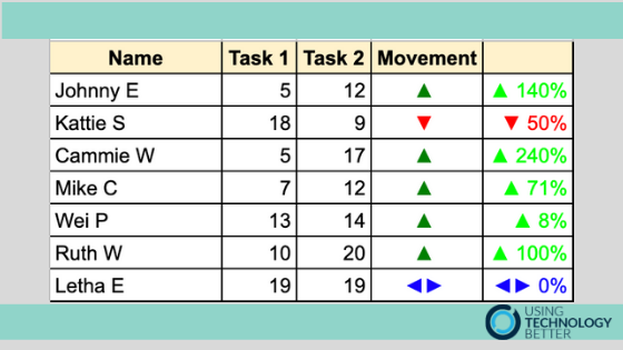
Sometimes when you have a lot of data it is easier to see trends when you apply colour and graphics. You can do this using a chart or a complex formula. It is far easier to use custom number formatting in Google Sheets to customise the formatting and see trends.
[bctt tweet=”Analyse data easily using custom number formatting in #Google #Sheets.” username=”adifrancis”]
To learn more about how to utilise the power of Google Sheets, check out our online courses.


