


All teachers are designers. By mastering a few simple techniques, you can be sure the resources that you create and use engage all students. This is not just about making things look good, as effective design can make information more accessible and easier to navigate.
A poorly designed website or slide deck will lose the audience’s attention after 3 milliseconds and the average attention span of people is 8 seconds. Poor design can make information inaccessible and unappealing and quickly lead to disengagement. I am a big fan of the Universal Design for Learning and good visual design can support students in many ways.
A poorly designed website or slide deck will lose the audience’s attention after 3 milliseconds and the average attention span of people is 8 seconds. Poor design can make information inaccessible and unappealing and quickly lead to disengagement. I am a big fan of the Universal Design for Learning and good visual design can support students in many ways.
The key principles of design are:
- Alignment
- Colour
- Hierarchy
- Balance
- Emphasis
- Contrast
Google has worked hard to ensure it’s users have easy access to visual design support through some simple but underused functions. I am going to explain some of these features in terms of Alignment, Hierarchy and Colour and will cover the other principles in future blog posts.
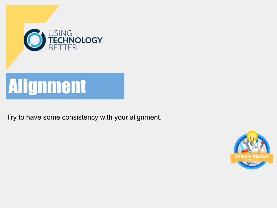
Alignment
Alignment is the art of lining elements up. Unconsidered alignment is like an out of tune song. An overly unaligned layout is the equivalent of listening to some terrible Metalcore with a headache! Luckily Google has taken care of this for us with their alignment guides.
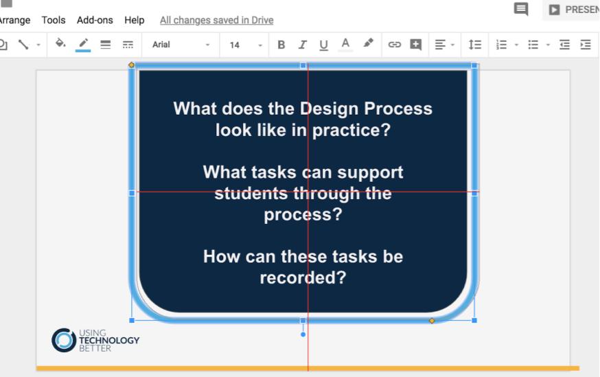
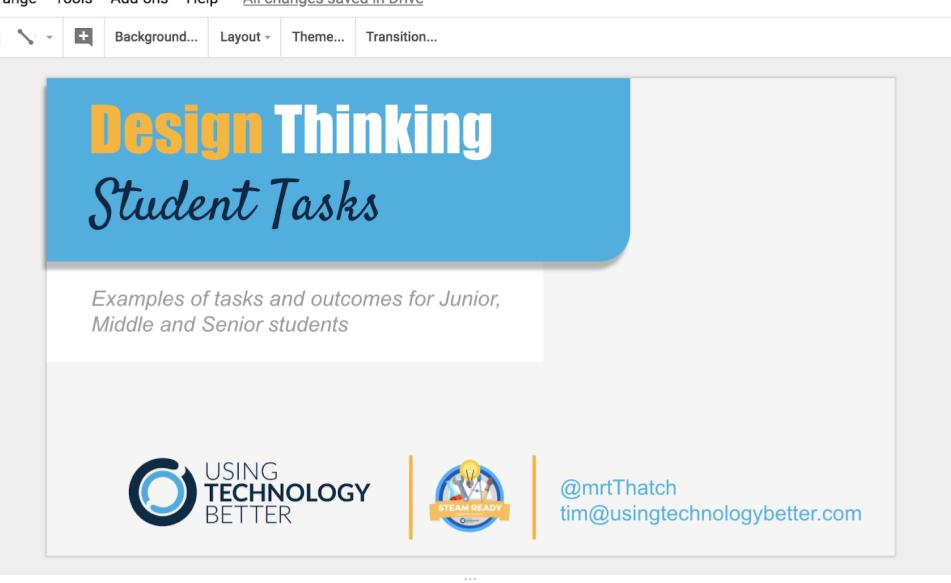
In Google Slides and Drawings, as elements are moved, red guides pop up. They show us when our object is lined up with other elements or whether it is centrally aligned on the slide. The guides on the image below are telling me my text is both vertically and horizontally aligned.
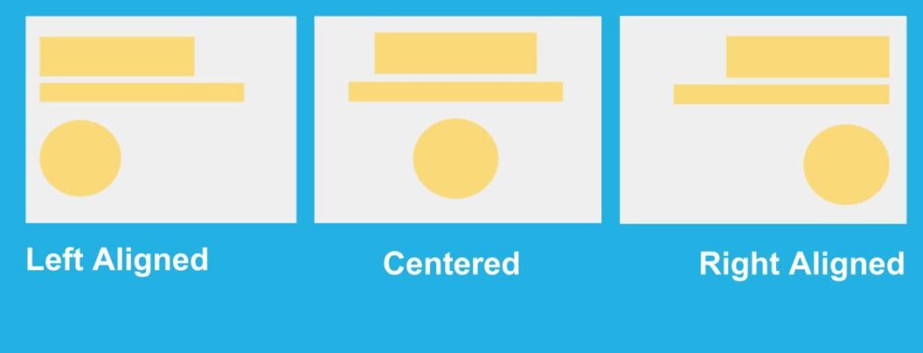
Try to have most elements aligned with some sort of logic such as left aligned, centered or right aligned. You can, of course, mix these up but keep it simple!
When thinking about Alignment, also pay careful attention to margins and proximity. When I move our logo, Google is telling me how my positioning is in proportion to other spaces essentially suggesting where I should place my object. This ensures it is in harmony with the proportions and margins already happening in the design.
In the first example below, which by the way is a complete design crime, there is no consistency in the spacing. There is a nice even margin on the left but the logo is ‘kissing’ one side of my shape and then spaced out on another (never have anything just touching, either have it spaced well or overlapping). Then the top of the title is nearly touching the yellow shape while the subtext has a completely different spacing. The version on the right is much better and more easily read.
Colour
Colour is tough! I should admit at this point that I slept through most of our colour theory lessons at Design School. Many teachers and students use a random assortment of colours which can not only distract from key information but also have some emotional impact. The golden rule is to use complementary colours which allow you to create focal points and a pleasing aesthetic. Another rule is to shy away from Primary colours as they are jarring and make the design overly saturated. Google does not provide a lot of help with colour but there are two things you can do if you want effective colours.
Eyedropper Add-ons
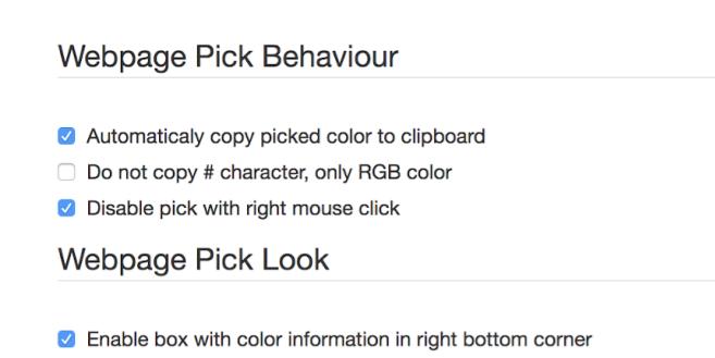
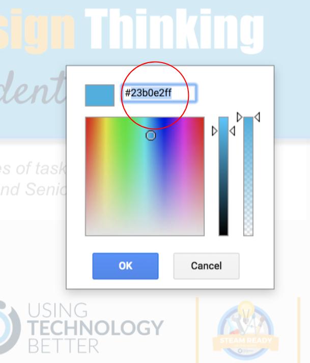
There are a few Chrome Add-on’s which help you sample existing colour palettes. Go to the Chrome store (if you’re not sure how to do this visit this link) and search for ‘eye dropper’. This one by kepi.cz has worked well for me and my students. When you have added it to Chrome make sure you go into settings and tick the ‘Automatically copy picked colour’ box.
To use this, look up ‘Colour Palettes’ in Google image search and find a colour palette that you like. Try to avoid overly blue or cool palettes as they are calming and might make your audience feel sad. Look for a palette with at least one warm colour.
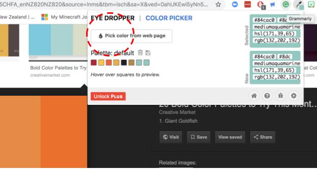
When you have found the colour you like click on the eyedropper add-on and select the ‘Pick colour from web page’ button. Then click on the colour you want so that the eyedropper adds the colour to your palette. Now go into Slides and select the shape or text you want to be that colour and go into the ‘Custom’ section.
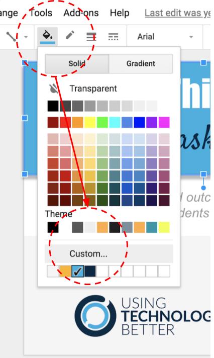
Now if you have ensured the eyedropper has saved the colour code onto your clipboard, you can simply paste in this code and you will have your colour. Simply repeat the process for the remaining complimentary colours.
Paletti Add On
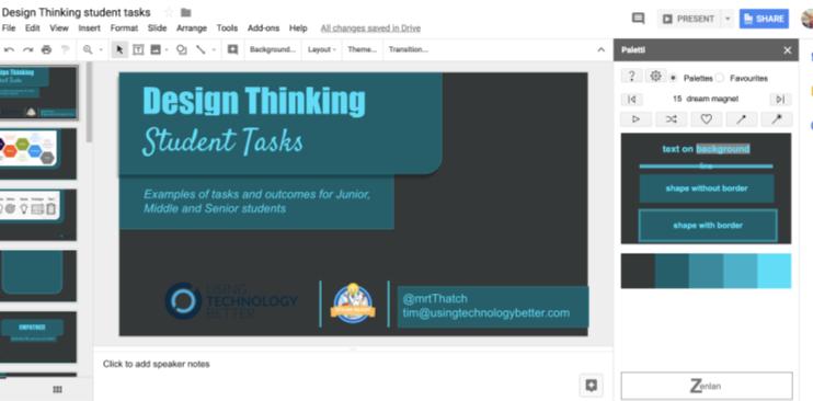
Another way to ensure you are using effective colours is to install the Paletti Add-n in Google Slides. Go to ‘Get Add-n’s’ and search for Paletti and add it to your Slides. Then start Paletti by clicking on it and selecting ‘Start’.
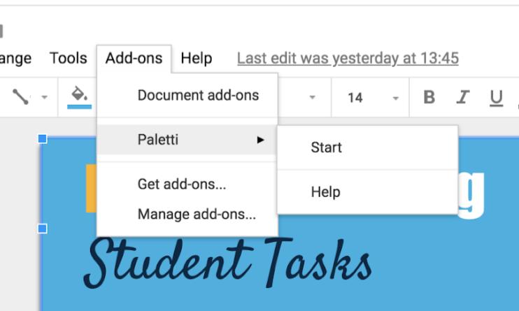
I won’t explain the full functionality of Paletti but basically you can scroll through colour palettes then click the magic wand tool and it will apply your selected colour palette to your presentation. It often needs a little formatting to chill it out but overall it will make your colour selections look sophisticated.
Hierarchy
When used alongside effective colour and alignment, Hierarchy is an extremely useful design principle. With Hierarchy you are essentially controlling the order in which viewers access information. There are several ways to control the order in which information is revealed:
1. Size: The larger something is, the more dominant it is.
2. Colour: Warm colours will attract attention first over cool colours
3. Contrast: Saturated and sharp colours and shapes will get attention sooner than soft colours and shapes.
In the example below I have made the title bold and high contrast with a warm accent colour over a blue, curved shape. The least important text I have made a mid-grey as I want it to be read after the titles. Often Slides are designed with all text being black and this tends to flatten the hierarchy and make the eye skim over the text. Try using shades of grey (I know what your thinking and no I have not seen the movie) to add some order.
While there are no specific extensions or Add-on’s to help with hierarchy you can play with the three elements above to control the order in which viewers access your information. Also, try using the Explore function in Slides. This function will set up some hierarchy for you.
Summary
If you are making resources for students, teachers or other colleagues, you are a designer. You do not need to over think what you are doing but try to use tools such as guides, colour palettes and the Explore tool to help your viewers access what they need. There will be people viewing your resources who may have learning difficulties and elements like poor alignment add to the medley of barriers they face.
When in doubt keep the following points in mind:
- Have a sense of order to your design.
- Use complementary colours.
- Let Google do some of the work for you.
- Less is more.
The skills we covered above are also relevant for students to learn. Last week I had the pleasure of working with Year 5 and 6 students on the design principles by designing a business card. The skills they learnt in this workshop will help them become visually literate and powerful visual communicators.
For more great tips and tricks to help you with your design check out this blog post about dealing with images.