


As a maths teacher, I always liked collecting data and finding the strength of the relationship between the data. Making a scatterplot and finding the line of best fit or trendline was a piece of cake in Excel, but I could never do it in Google Sheets until I found a way to build a meaningful scatterplot, put in a trendline and find the correlation coefficient within a couple of clicks.
If scatterplots are a foreign concept or how to find the strength of the relationship between data, read on.
Here’s a helpful metaphor to illustrate how a scatterplot works. If we put a pot of water on some heat and measure the temperature at certain times, we would get two pieces of data that are related to each other. If we heat the pot for a longer period, the hotter the water will become. This is called a direct correlation.
If we collected the data and put it in a table we would have two variables and be able to draw a scatterplot of time versus temperature. The stronger the relationship between the two variables the stronger the correlation is. A perfect correlation is 1 and this can be represented by r2.
When we put data like this into a table and draw a scatterplot in Sheets, we would get a scatterplot that looks like this.
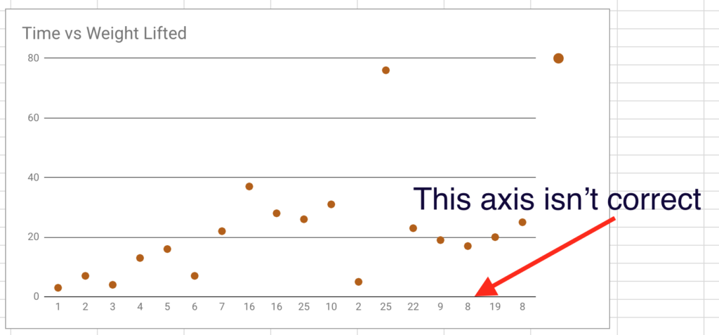
This is not correct as it is treating the data on the x-axis as text and not numbers. Follow these steps to change this:
- Create a scatterplot by highlighting the data and clicking on Insert > Chart
- Change the chart style from column to scatter chart
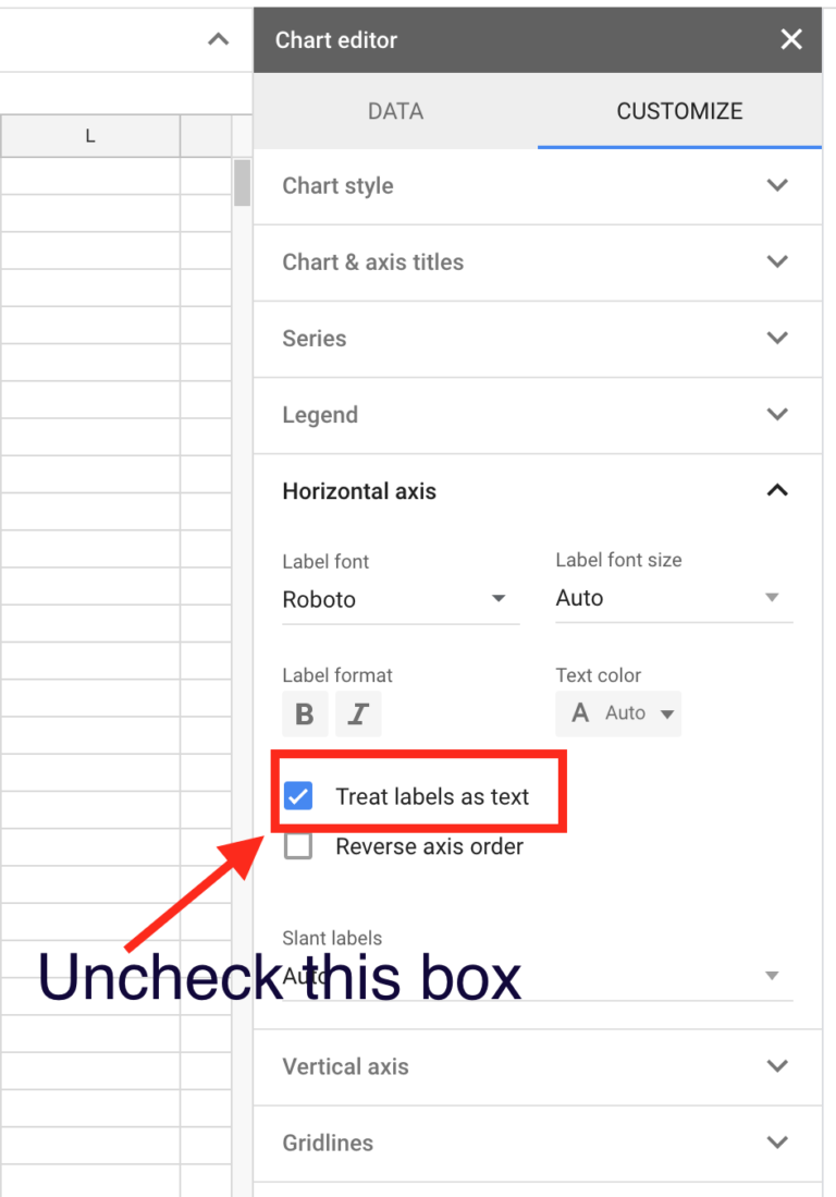
- Click on Customise
- Go to Horizontal axis
- Un-check the box that says Treat labels as text
Click on Series
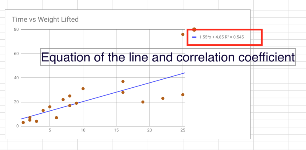
Check the Trendline box and the Show R2 box.
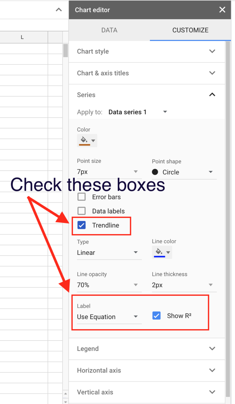
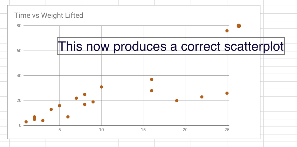
This now displays a scatterplot of your data, shows you the formula of the trendline or line of best fit and shows you the strength of the correlation.
This allows students to gather real data, tabulate it and then present and analyse it in a meaningful way. This ticks the boxes for me as a teacher as the students are able to hypothesise about the relationship between two variables and then test it easily using Google Sheets and a scatterplot.
Check out our other blogs on combining text and numbers in cells, using macros in macros in Google Sheets and tips and tricks in Google Sheets.