I once heard Google Slides described as the swiss army knife of G Suite. How true is that? One tool that can do SO many different things! But it’s also probably one of the most overused tools, when used in its simplest form. How many slides have your students produced – whether it be in Google Slides or Microsoft’s PowerPoint – where there has been little, or no, thought given to the design of the slides. There’s been a mismatch of colours and far too many words per slide. There may also have been a stack of images or shapes randomly placed across the slides and the overall look leaves you ready for a stiff drink! And this may not be restricted to just your students – many of my colleagues over the years have been guilty of this also!
[bctt tweet=”There’s no need for bad slide design in #GoogleSlides or #PowerPoint. Use templates! #utbPD #edtech”]
How do we address the issue of design in slides?
I must confess to having been guilty of these sins in the past myself. One of the easiest, quickest and simplest ways to address my own lack of knowledge around slide design was to use a pre populated template. Once I began using these my slide design improved immensely!
There are now a few websites available to help you out with this. Let’s look at what they offer…
No 1: SlidesCarnival
A few years ago now I discovered the website Slidescarnival.

When I first came across SlidesCarnival there were a huge number of free templates that could be used with either Google Slides or Microsoft PowerPoint. Now it also has templates for Canva (a popular site used by many people to design posters, infographics and more).
You are able to filter the site by colour preference or by the type of template you are looking for. When you find the one you want to use you click on it to be taken to a page that gives you more information about it. If you decide you don’t like the one you’ve chosen after all it will suggest similar templates for you. From there you can download the PowerPoint version or make a copy of the Google Slide version.
[bctt tweet=”Use @slidescarnival to look for free templates to use #utbPD #edtech”]
You can even subscribe and be notified whenever a new template is released.
Each template has different layouts ready for you to use and all the colour choices are already made for you.
Suddenly you no longer have those slides screaming at you with mismatched colours and frustrating layouts. 👍
No 2: SlidesGo
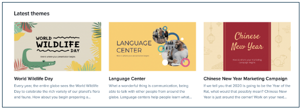
Slidesgo is similar to SlidesCarnival and can also be filtered. What I like about their filter is that it has a specific Education and Business filter. It doesn’t have a filter by colour option though.
These templates can also be used for both Google Slides or Microsoft PowerPoint.

Much like Slidescarnival, when you select the template you would like to use you are first taken a page that gives more information about the template so you are fully informed of how it looks and what it contains before you either download the Powerpoint version or make a copy of the Google Slide version.
As you scroll down their home page you will find tutorials around slide design or how to use different features in both Slides and PowerPoint – these are great for using with your students or sharing with your colleagues.
[bctt tweet=”Check out the quick tips for improving your slides with @slidesgo #utbPD #edtech”]
No 3: SlideGala
Slidesgala is very similar to the previous two with similar filters, but no colour filter. What is special about this site though is that their templates work with not only Google Slides, Microsoft PowerPoint but some will also work with Apple’s Keynote.

When you select a theme in SlidesGala you see an embedded version that you can move through in order to see the different layouts within the deck.
No 4: SlidesMania
Slidesmania is the last of the sites we’ll look at in this blog and has Google Slides or Microsoft PowerPoint options.
This site does have a colour filter and once you select a slide it also has categories on the right hand side.

Like SlidesGala, when you select a template you want to explore more, it takes you to a page with the template embedded so you can move through all the different slides to check out the layouts.
This is the only one of the four sites reviewed that doesn’t give you a rating for the template. The previous three sites will all show you a star rating for the template based on user feedback.
Now there are no more excuses for your students or your colleagues to produce slide decks that offend the eye. Get them to check out the above sites, I’m sure there’s one that will become a favourite – or like any digital tool, use the one that’s best for the job at the time.
If you want more tips and tricks about slide design you can read Tim’s blog on how to Improve your Design Skills in Google or check out a UTB slide deck with Design tips.


