


When looking through Google Docs, teachers try to find out our students’—the end users—experience or level of engagement.
What are the constraints and how does it affect the end users? Watch this podcast to find out.
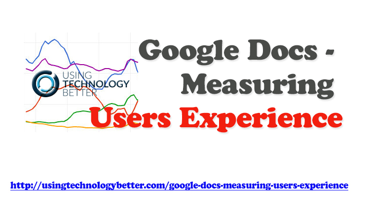
Video Highlights
0:00:01 What do you look for when measuring Google Docs usage?
Transcript: How to Measure User Experience Using Google Docs
Mike: All right. So, you’re measuring your Google Docs usage; maybe a drive if you’re using Office. You’ve got some reporting metrics around that for your Office 365. And you know, Blake, if you’re just looking at your own service—I’m sure you’ve got some—we would be able to pull some metrics on that.
What do you start to look at next?
Blake: Well, I think—sort of, almost, before you, at the same time, you’re looking at Google Docs—you also want to be looking at what is the experience of the users. Like, one of the big problems of, you know, going to Google and cloud-hosted services is, that it does create a bit of a strain on your networking.
If you are starting to use YouTube a lot more, or, you know, collaborating on documents with the images in them and sharing stuff on drive and downloading and uploading, I mean, what’s that going to do? That’s going to hurt your Internet connection. And that’s one of the big complaints that we hear. You know, what about our Internet? You know, how is that going to cope? And that’s a very good question. How is that going to cope? So, we need to get some data around it. And we need to set a baseline and then figure out how it is coping. And, at the same time, we want to know that when we’re accessing Google, when we’re accessing your student-management systems, like compass or sector, if they’re cloud-hosted ones; they are operating at that relative speed as well.
So, what we do with a lot of schools is, helping them with their black box. I actually got a shell of one here. It’s a little box, like this, where we plug into the network port here, and basically it will sit on the network and do a probe on certain Internet services, depending on whatever was setup. For us, we look at Compass, we look at Google. We look at a whole range of services and then we sort of graph that out into a Google spreadsheet. I can show you what that looks like, to give us a better understanding of what the experience is like for a user on the network.
Because a lot of Internet monitoring graphs goes, “Oh, that’s fine, I can monitor our Internet. That’s easy.” You know, I’ll look at the graph on the router and it says, “We’re doing 18 megs a second.” And we got a 100 meg Internet connection, so we’re fine. Well, the reality is that: That’s the amount of through-put you’re putting through the network. That’s not the experience that someone is having on the network.
So, one of the things we do with this box, this Intex box as we call it, one of the things we do with that is, put this box in the schools’ network and try and get out to those services at the very same time that everyone else is trying to get out to those services. And then we say, “Okay, now what’s really going on?” Are we seeing that there’s severely server problems before lunch? Or, you know, whenever I leave for the day, everything goes quick again? You know, if we’re seeing a load like that, then we want to start to address the Internet connection.
So, I’ll show you the graph of that now.
Mike: Yeah, that will be great.
Well, should mention we’ve done a little bit of work together on just trying to pull together ideas like this for schools. And, so, if this is of interest to you, I’m more than happy to help you out and get you a black box going in your school.
Or, we’re actually running some Google apps, Admin-consult training on the second of June. So, if you’d like to sit in with us for an hour and just work out how do you really use your Google Admin consult, then we’ll put the link to that in the show notes as well.
Blake: Yeah, cool.
So, this is the example of the Intex box. All it does is, it basically pumps a line into a spreadsheet. And we administer all these through another spreadsheet exactly how we set it up. But what it will do is put a line in here and test www.google.com and test www.live.com for office, schools, office 365. It tests that Compass login and then tests that upload. So, you know, we’ve got Chrome Books a lot. So, a lot of things are being uploaded as well as downloaded. So, we use a little service where we just push a little image up there and we see how long it takes to push up there.
So, what that does is then, you know, every 15 minutes it does it again and again and again. And you’ll notice every now and again, it will do it one after the other. You know, it will do it a minute later. The reason that happens, and we see that here, is www.google.com rapidly went up. So, it went from 109 milliseconds to 2000. If that happens, it does a check straight away again to see if that was an anomaly or that was for real. So, it’s got a little bit of an arrow checking in there. And then what we do is, we just use Google Spreadsheets and we just work with it.
We can see during the holidays, we had a bit of network maintenance. So, it went offline. But if I just zoom in here, you can start to have a look at these services that we use at the school and how they operate throughout the term. So, this becomes very clear, down to the days the people are here and not here. You can see that’s a Saturday, Sunday—things are pretty quiet—and we start seeing these spikes and these losses and the speed go up. But this is actually really great, because now I can dive even deeper. I can pull that right in and have a look and say, “Well, you know what? You know, www.google.com is the blue one all the way down here, like Google is causing us no problems. It’s basically flatlining it.
You know, 100 or 93 and other services, like Compass, when we use it throughout the day, are really slow. Like, that’s to load the entire page of Compass, after you’ve logged in. And that takes 15 seconds, so that’s something we need to take up with Compass. That’s not our Internet connection. If we see all those lines move at one time—which I don’t think happens on our networking, really—but if all those lines move up at the same time, and all the services get slow, then we know that’s an issue with us.
So, it kind of serves two purposes here: We can say “Well, this is going to address an issue with our Internet connection. We can see the data on that, but we can also see the data on the deals we might have signed with Compass or other service providers or Office 365 or Google Apps or whatever it is. And we can say, you know, this isn’t cutting it. Like, this is too slow and this is not our Internet, because everything else is operating at a perfect speed.”
So, yeah, that’s the basics of how we sort of look into that data.
Mike: Yeah. And why this is so important for schools—just to make it really plain—is, that it comes back to that user confidence and experience that we started off talking about, right? So, quite often, people say, “We just need faster Internet. That’s going to make everything better.” But you can’t necessarily track that. And if you go and spend—let’s just say you spend an extra $5000 a year, or $10,000 a year, on Internet. How do you know that that’s actually changed anything at the call phase because the Internet wasn’t necessarily the issue?
So, it’s always good, before you go out and you start to spend large amounts of money, just put a relatively inexpensive box in your school. Start to get a baseline of data and then you can start to make targeted changes to your spending patterns and then you can track that change and see if you’re getting the bang for your bucks.
So, I’m really excited about this at the moment. Just even as just a normal classroom teacher, I can really see the value in that at the call phase. It’s not just something that the tech guys need to fix. But it’s something that actually impacts my teaching and learning experience in the classroom. So, I think it’s really cool.
Blake: And I think it’s all about being able to discern: You can actually discern if it’s the issue that you’re in or if it’s the other end. I mean, if people are saying to you, “The Internet is ridiculously slow. We need a new Internet connection.” and you put this in and you notice that the response time is fantastic and they’re really solid and they don’t move throughout the periods, they’re the same on the weekends they are during the day, then, you know, well, hang on. The issue is not the Internet; the issue is with maybe the Wi-Fi; the issue is with our network; the issue is somewhere else. So, you know, this is probably a less expensive way of diagnosing that problem than signing a contract for $10,000 to $30,000 for the Internet.
Mike: Yeah, absolutely.